
Now, we're all here waiting for the ownership group to go through the logo proposals. I'm assuming they are going to do the same community vote thing - but they may just decide to go ahead and choose one directly. I know they have been posting a few of the proposals on Twitter to get some feedback from fans. Let's take a look at a few of the proposals:
The Sign

I found this one on Reddit. This one is a hard pass for me. It's basically just that "Welcome" sign that everyone out of town loves, but I personally find pretty tacky. I think its the little circles around the letters that get me. It just looks - bad.
Grade: 3/10 - Basic copy of the sign, not enough difference
Inverted Sign
Another Reddit one. I actually like this one quite a bit, even though it incorporates that tacky sign that is posted on everything (probably because it flips the sign vertically, which I like, and eliminates the worst part of the sign, the "w-e-l-c-o-m-e" letters in little circles). I've always been a fan of narrow vertical logos, and the "LV" in Las Vegas just lends itself perfectly to overlapping letters like this.
Grade: 7/10 - but if you incorporated the yellow and blue colors the owners seem to be going with, it could go up to 8 or 9.
The Shield
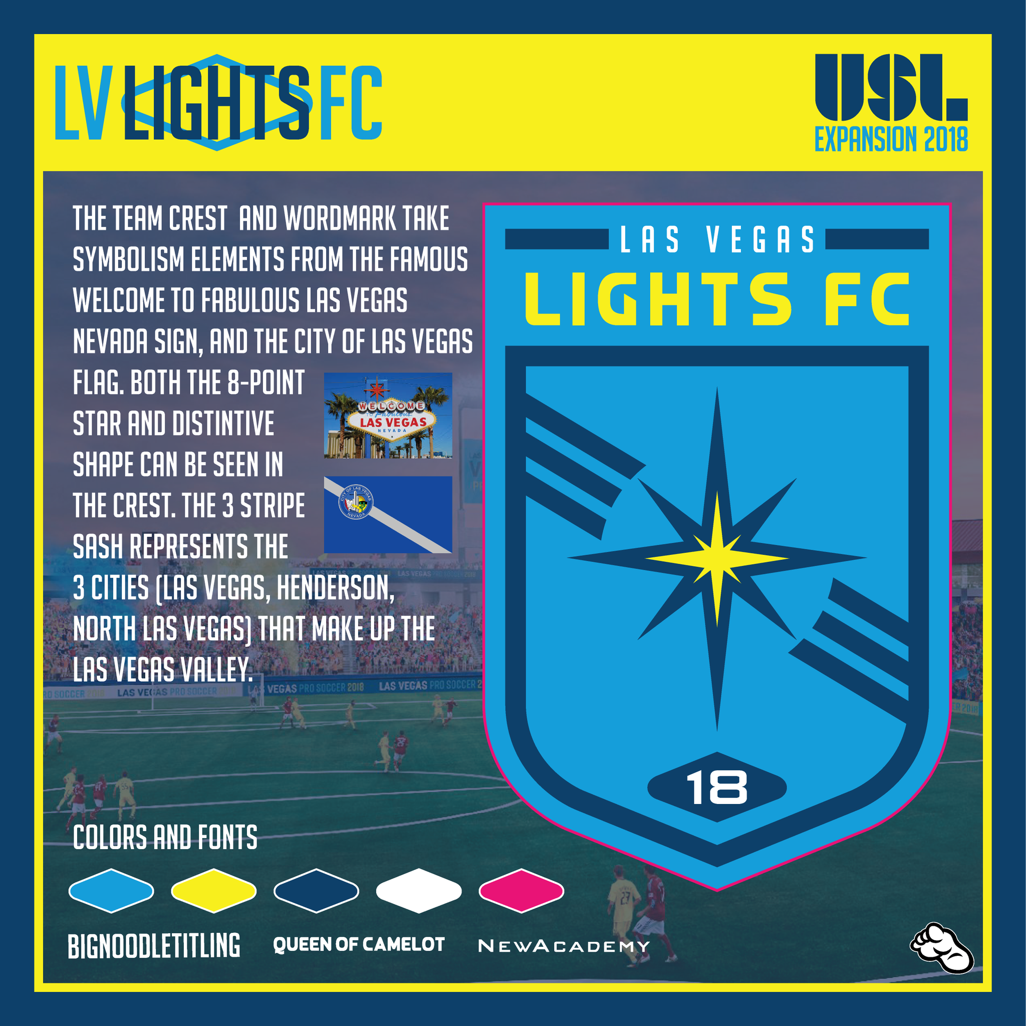
This one was posted on the Las Vegas Lights twitter feed, so obviously they are giving it some thought. I like this one a lot - I've always liked logos that have some sort of symbolism to them (even if you have to explain it all in an infographic like here). It avoids the welcome sign, which is nice. And you can't go wrong with a nice shield shape. Finally, the icing on the cake is the diagonal stripes - I love a good sash, and maybe with this kind of a logo we could have a sash on they jerseys.
Grade: 8/10 - Wouldn't mind having this one at all.
Vertical Stripes
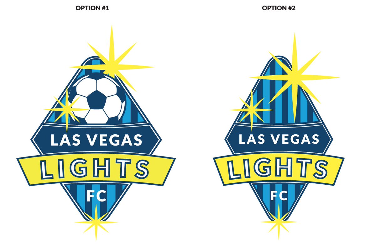
Two choices that the club put up on the Twitter feed. It's not bad. i definitely like the second option over the first (I've always found the soccer ball to be just a touch of overkill - we get it, it's a soccer team). The only downsides I see to this one are 1) they went pretty heavy on the starbursts, one would have been plenty, and 2) the vertical stripes, while cool, would probably mean that we are going with striped jerseys, which are ok, but I've never liked them all that much.
Grade: 5/10 - Too much stuff
The V for Vendetta
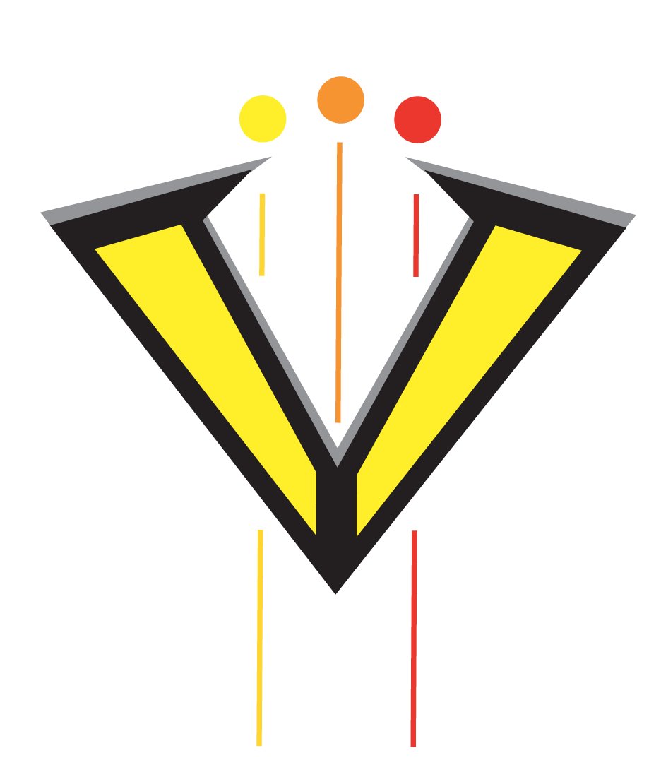
I'm really not sure what is going on here. It's a V, for Vegas, obviously. But where's the L? And what are those little flying multi-colored balls for? I don't really get this one, the logo is decent, I suppose, but I really don't get any sort of sense of "Las Vegas" or "soccer" from it at all.
Grade: 3/10 - No connection.
The Overachiever

I mean, how could we not choose this one?
Grade: "A" for effort
So, looking at my grades, I think (aside from the obvious choice being the last one), if I had to choose now, I'd go with the shield proposal. But if they make a few tweaks to that inverted sign, without adding too much to the logo, I think that would be my first choice.
Let me know what you think on Twitter.